GO2bank vs. Chime:
Competitive Research
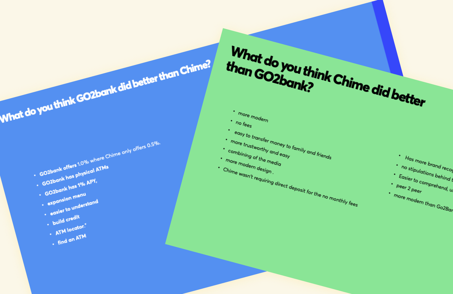
In order to gain insight into the factors that influence consumer choice, we conducted a series of unmoderated interviews and solicited feedback from a diverse range of participants. By carefully analyzing the data collected from these interviews, we were able to identify key areas of improvement for the GO2Bank website. As a result of these efforts, we were able to achieve a 15% increase in the number of online open accounts.


Three themes surfaced from the research
IMPORTANT FEATURES FIRST
How can we make the website more scannable?
Important features: fees, credit builder, savings should be highlighted
Visual balance of images / text
Get rid of redundant information
FEES ARE IMPORTANT
How can we make understanding fees easier?
If there are fees, I want to know what they are
ATM locations, where are they?
Don’t want to feel tricked
TRUST & TRANSPARENCY
How can we increase trust and transparency with our customers?
Feel more personalized
Who are we as a company?
Clear benefits, no gimmicks